Barry McMahon
Art/Creative Director | Brand, Product & Experiential Design
Creative direction spanning branding, experiential environments, product storytelling, environmental graphics, retail systems, digital campaigns, motion design, and emerging AI-assisted workflows. Work frequently combines concept development, visual identity, narrative structure, production direction, and hands-on execution across physical, digital, and customer-facing experiences.
SOLTEC HEALTH
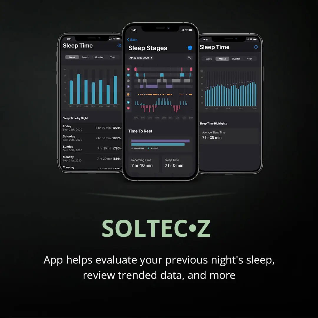
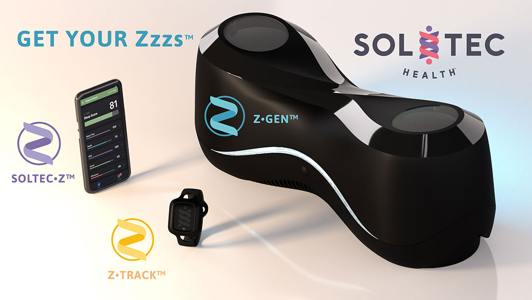
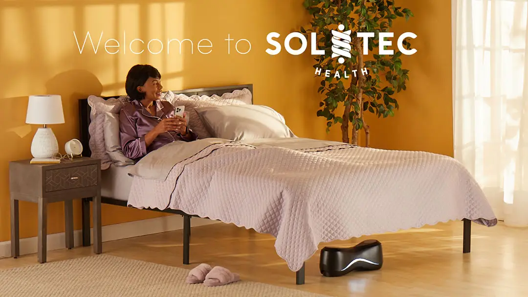
Led the conception, development, and execution of customer-facing creative systems for a sleep technology company across web, video, e-commerce, social media, digital advertising, retail, and trade show environments.
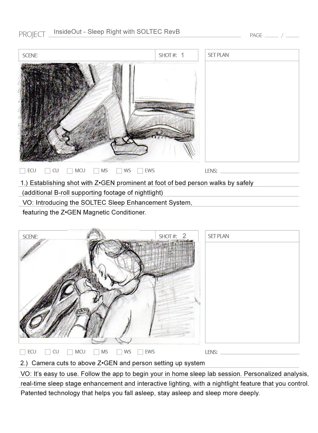
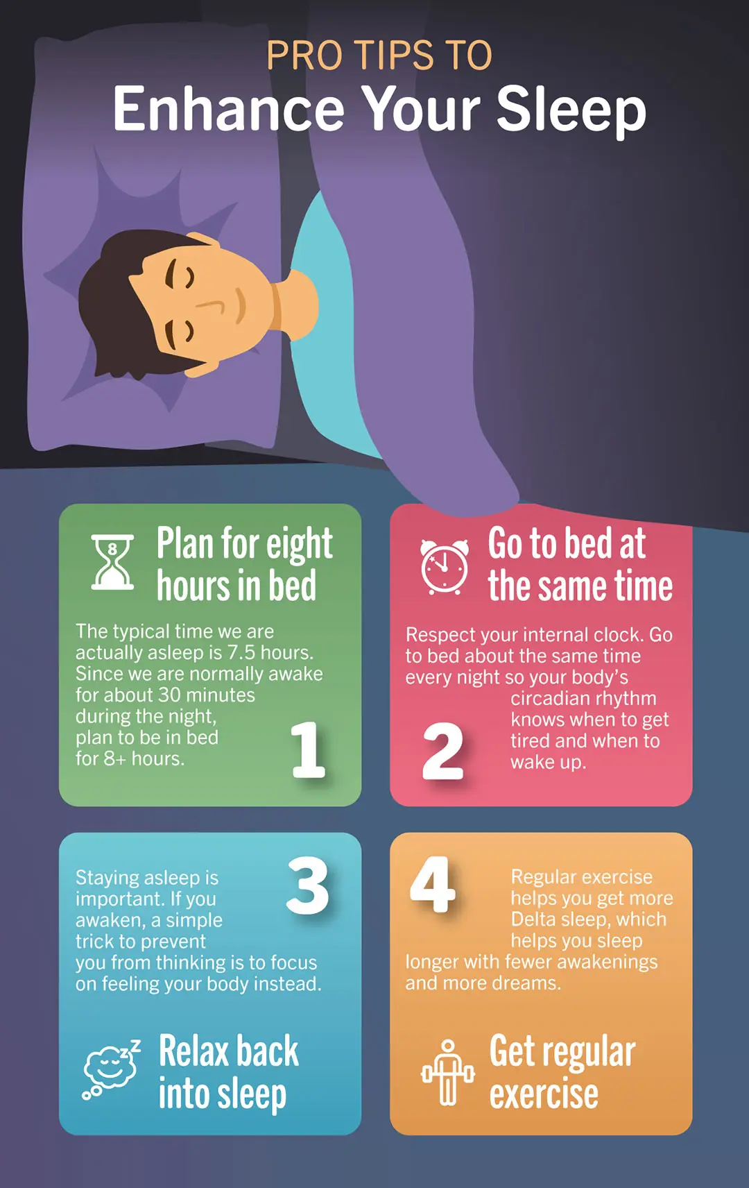
Created campaign concepts, wrote scripts, illustrated storyboards, developed product demonstrations, and directed visual storytelling from initial idea through final delivery.
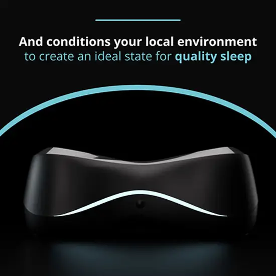
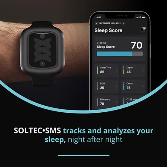
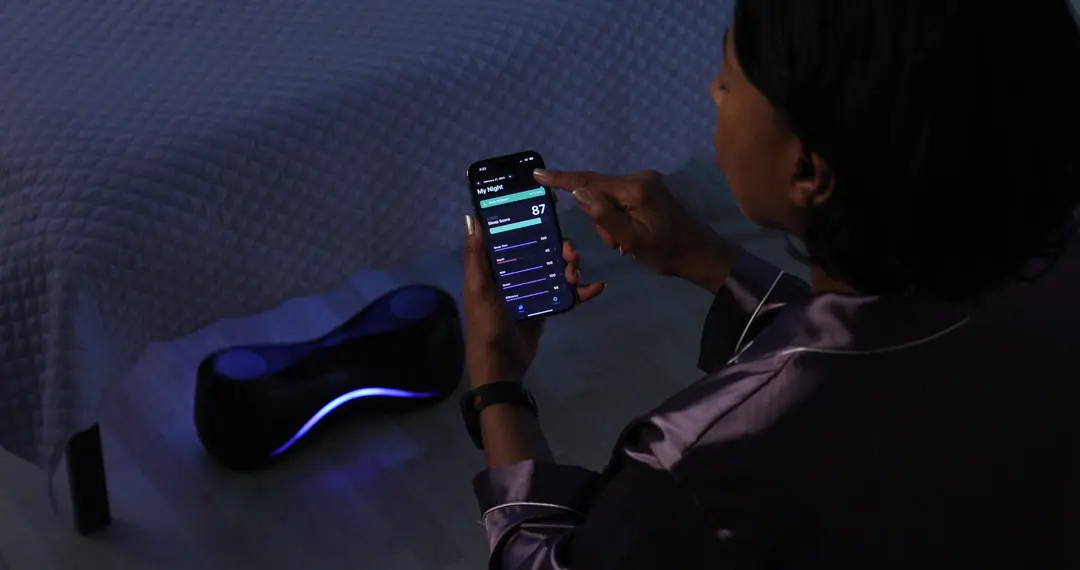
Produced the majority of product imagery and campaign visuals using Cinema 4D and Photoshop, including 3D product rendering, lighting, compositing, motion graphics, and previsualization workflows used across advertising, social media, web, packaging, and launch materials.
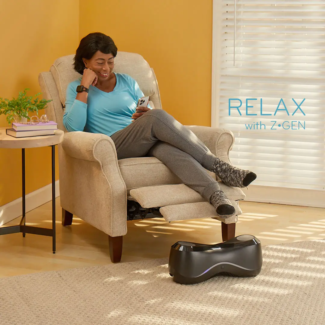
Directed photography, styling, set dressing, editing, vendor coordination, and environmental presentation while simultaneously shaping the broader visual identity and communication strategy surrounding the SOLTEC ecosystem.
In many cases, projects moved from concept development to finished campaign execution through a single continuous creative pipeline directed and produced internally.
BILIMBI BAY / FAMOUS INVESTMENTS
Led the creative development and environmental branding for Bilimbi Bay and related hospitality concepts under Famous Investments, helping transform restaurant spaces in Minnesota into immersive Caribbean-inspired destinations.
Responsibilities extended from early concept development through execution, including logo systems, menus, environmental graphics, promotional campaigns, food styling, merchandise, photography direction, print advertising, and customer-facing storytelling designed to transport diners from everyday Midwestern surroundings into a relaxed island atmosphere.
Painted large-scale murals and environmental artwork throughout all three restaurant locations while simultaneously developing the broader visual identity and experiential language surrounding the brand.
Worked directly with chefs, photographers, fabricators, printers, vendors, and production teams to shape cohesive branded environments spanning interiors, advertising, signage systems, promotional materials, and launch campaigns.
Projects frequently combined branding, hospitality design, environmental storytelling, experiential marketing, and hands-on production into unified customer experiences intended to feel atmospheric, memorable, and escapist rather than purely transactional.
BRAND & IDENTITY SYSTEMS
Alongside larger experiential and environmental projects, additional work included brand identity development, logo systems, promotional design, print campaigns, retail graphics, franchise materials, packaging concepts, direct mail, and customer-facing visual systems developed through an independent studio practice operating as a small creative agency of one.
Projects frequently involved helping businesses establish cohesive visual identities across signage, print, advertising, merchandise, retail environments, packaging, and promotional materials while balancing practical business needs with distinctive visual character.
Selected identity and branding projects are represented below.
The Go Cat Go identity system extended beyond the logo itself into a broader visual language built around color, shape, typography, and playful asymmetry. Packaging, merchandise, promotional materials, and environmental graphics were developed as interconnected parts of a recognizable brand atmosphere rather than isolated graphic elements.
The intent was to create a visual system where the palette, character design, graphic rhythm, and overall tone became as immediately identifiable as the logo itself, allowing the brand personality to remain recognizable even when the mark was partially obscured or absent.
FORM, COLOR & VISUAL SYSTEMS
My work has consistently explored the relationship between atmosphere and clarity — balancing an artist’s instinct for color, shape, rhythm, and visual energy with the practical demands of communication, usability, and brand recognition.
Whether developing environmental graphics, hospitality concepts, product visuals, packaging, advertising, merchandise, murals, digital campaigns, or identity systems, I approach design as an interconnected experience rather than a collection of isolated assets. Color palettes, typography, forms, textures, materials, and spatial relationships are treated as parts of a larger visual language intended to create emotional continuity across every customer touchpoint.
I remain deeply interested in experimentation and exploration, continually pushing visual systems beyond convention while maintaining the clarity and recognizability required for effective communication and memorable brand experiences.